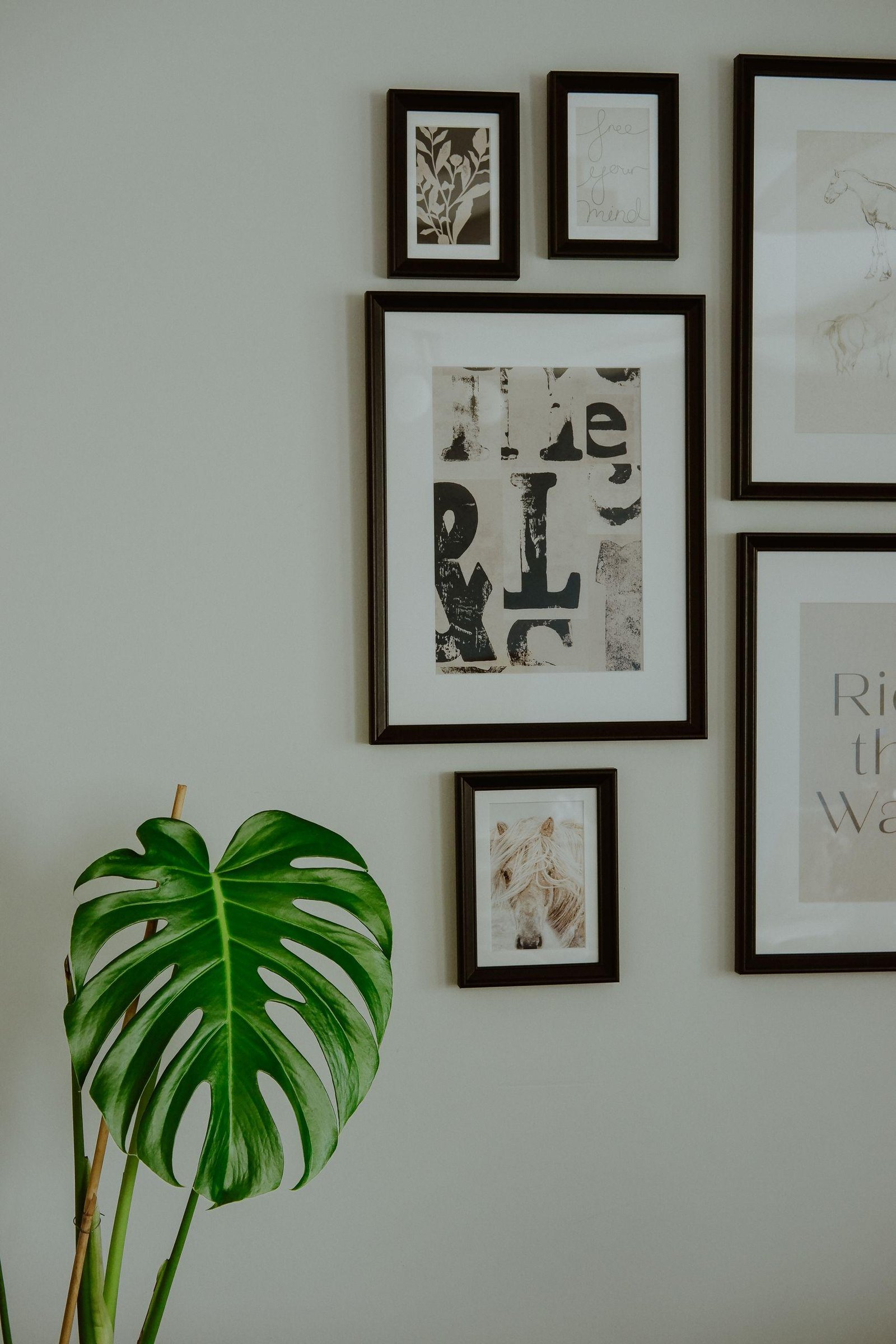
Gallery wall ideas can feel exciting and a little overwhelming at the same time. A well-planned gallery wall adds personality, colour and warmth to a room, but a wall full of frames hung without a plan can quickly look messy. The good news is that you do not need a designer or a perfect collection to get it right. You need a layout that suits your wall, a little planning on the floor first, and an awareness of the mistakes that make gallery walls go wrong.
Start with the layout, then read the mistakes section carefully. It is just as important as the ideas themselves, and it will save you a lot of holes in the wall. These gallery wall ideas work best when you choose one layout before you buy frames.
Table of Contents
Gallery Wall Ideas: Easy Layouts That Work
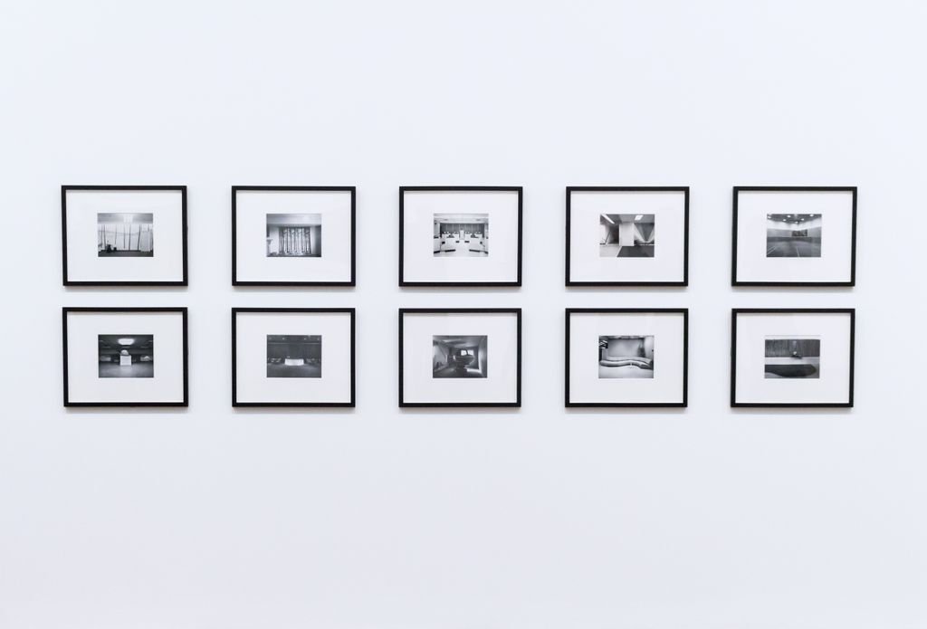
The Grid
A grid uses frames of the same size, evenly spaced, in neat rows and columns. It looks calm, orderly and modern, and it works beautifully above a sofa, a console table or a bed. Use the same frame colour for a clean look, or the same size with mixed frame colours for a softer version. A grid is also the easiest layout to expand later, because you can simply add another row or column. Of all the gallery wall ideas here, the grid is the most forgiving if you are hanging your first wall.
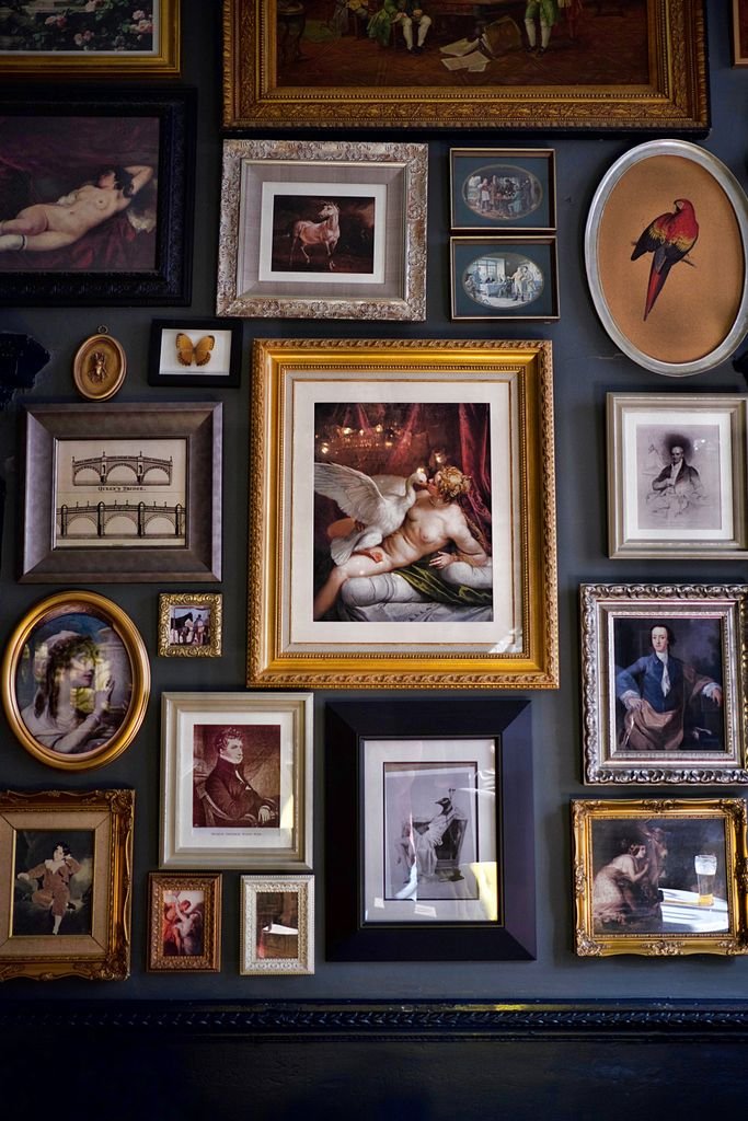
The Salon Style Cluster
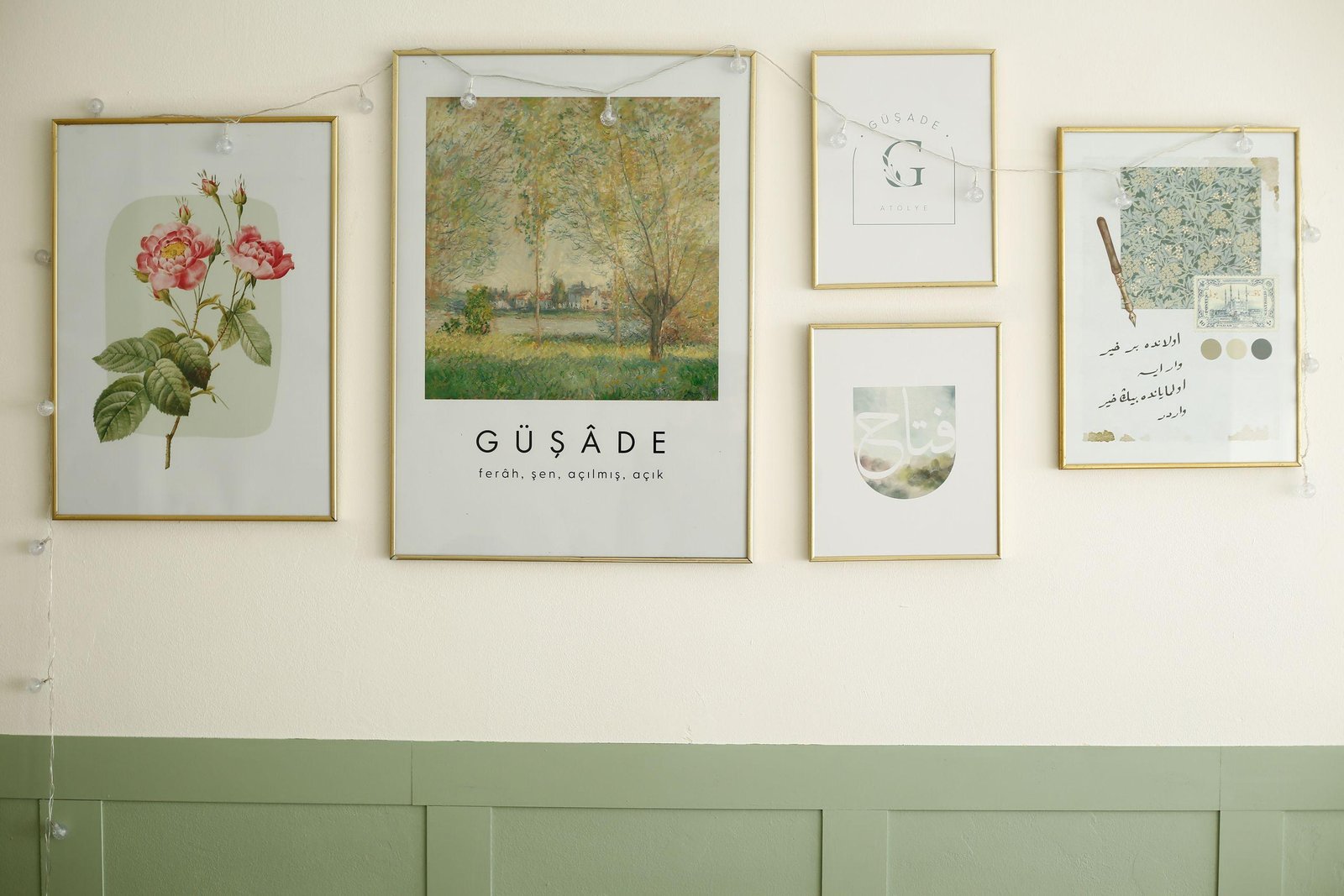
A salon-style cluster mixes frame sizes, shapes and art styles around one central piece. Start with the largest frame in the middle, then build outward, keeping gaps fairly consistent. This layout feels collected and personal, like art gathered over time. It suits living rooms, staircases and walls where you want a relaxed, gallery-like feel. This relaxed approach is why salon-style gallery wall ideas suit homes that keep adding art over time.
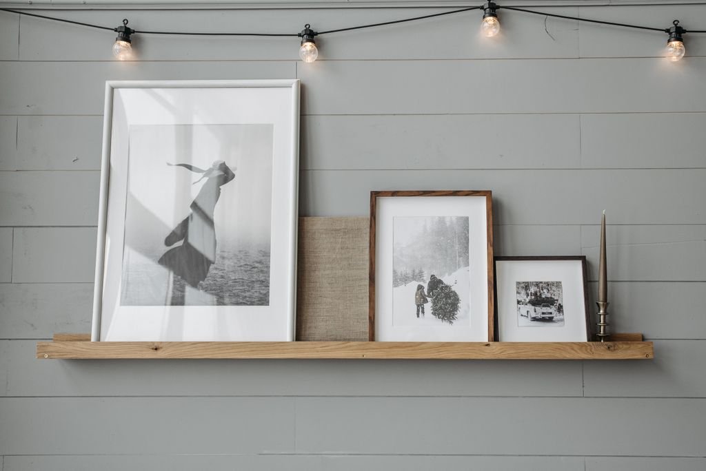
The Ledge Display
If you do not want to hang many frames, use picture ledges. Lean frames on two or three ledges, overlapping them slightly, and change the art whenever you like. This is perfect for renters, for children’s rooms, and for anyone who likes to refresh a wall often without new holes. For renters, these gallery wall ideas are easy to change without leaving a wall full of holes.
The Single Row
A single row of frames at eye level works wonderfully in hallways, above a long console, or along a staircase. Keep the centre of each frame at roughly the same height, even if the frames are different sizes. The row feels intentional and uncluttered, and it draws the eye along the wall in a gentle line. A single row is one of the simplest gallery wall ideas for a long, narrow wall.
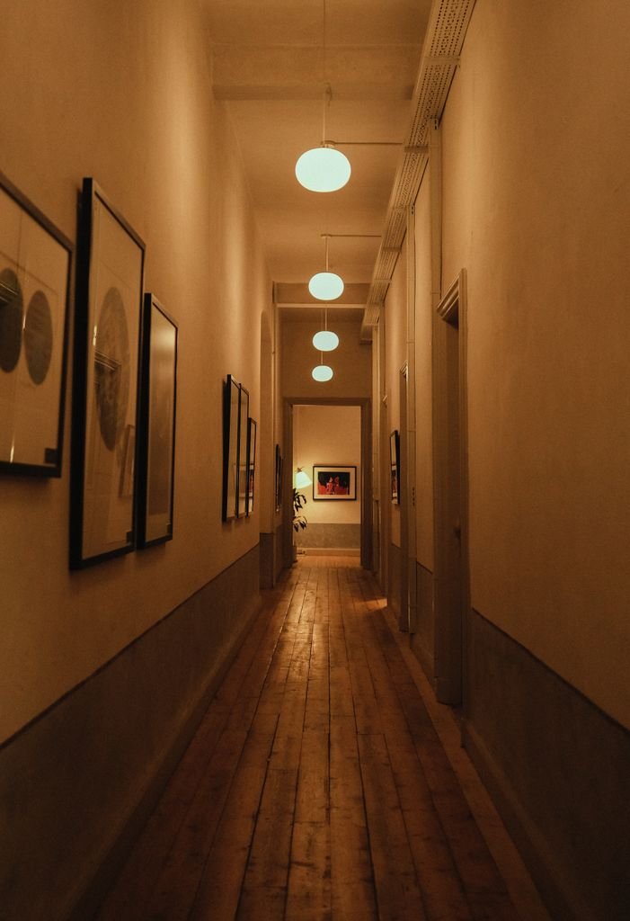
Before you hang anything, lay your frames on the floor in the layout you have chosen and live with it for a day. Take a photo, step back, and adjust spacing before you pick up a hammer. Paper templates taped to the wall are also a wonderful trick, especially for a cluster layout. Testing gallery wall ideas on the floor first is the simplest way to avoid extra holes later.
6 Mistakes to Avoid
Mistake 1: Hanging Everything Too High
One of the most common gallery wall mistakes is hanging art too high. When frames sit far above eye level, they feel disconnected from the furniture below and the wall looks empty in the middle. The fix is simple: aim for the centre of the arrangement to be around eye level, or about 15 to 20 centimetres above a sofa, console or bed. If you are hanging above furniture, the bottom of the frames should relate to the furniture, not float near the ceiling.
Mistake 2: Uneven Spacing
Inconsistent gaps between frames make even beautiful art look untidy. Some frames touch, others are far apart, and the eye does not know where to rest. The fix is to choose one spacing, usually 5 to 8 centimetres, and use it consistently throughout the layout. For a grid, be especially strict. For a cluster, allow a little more variation, but keep the gaps in a similar range so the grouping still reads as one wall, not several separate pieces.
Mistake 3: Mixing Too Many Styles at Once
A mix of art styles can be charming, but too many competing styles, colours and frame finishes can make a wall feel chaotic. Bright posters, dark photographs, ornate gold frames and plain white frames all fighting for attention will tire the eye quickly. The fix is to choose one unifying element. It could be a consistent frame colour, a shared colour palette in the art, or a similar style of print. You can still mix subjects and sizes, but that one thread will hold the wall together.
Mistake 4: Choosing Frames That Are Too Small
Tiny frames on a large wall can look lost, even if the art inside is lovely. This is especially common above a sofa or a bed, where people hang a few small prints and wonder why the wall still feels bare. The fix is to scale up. Use larger frames, add more pieces, or group small frames tightly so they read as one larger shape. As a guide, a gallery wall above a sofa should be roughly two-thirds the width of the sofa, not a small cluster floating in the middle of a big wall.
Mistake 5: Ignoring the Furniture Below
A gallery wall does not exist in isolation. If it ignores the sofa, console or bed below it, the room can feel disjointed. Art hung too far from furniture, or in a width that does not relate to what is underneath, creates a visual gap. The fix is to plan the wall and the furniture together. Centre the arrangement over the furniture, keep the width in proportion, and leave a consistent gap between the top of the furniture and the bottom of the frames. When the two relate, the whole room feels more settled.
Mistake 6: Hanging Without a Plan
Perhaps the biggest mistake is starting with a hammer instead of a plan. Hanging one frame, then another, then trying to fit the rest around them usually leads to extra holes, crooked rows and a layout that feels accidental. The fix is to plan first. Lay frames on the floor, use paper templates on the wall, photograph the layout, and only then start hanging from the centre outward. A little patience at this stage saves a lot of patching later, and it almost always leads to a wall you love for much longer.
Conclusion
A beautiful gallery wall is less about having perfect art and more about having a clear layout and avoiding a few common traps. Choose a layout that suits your wall, keep spacing and height consistent, scale your frames to the space, and plan before you hang. Then step back and enjoy a wall that truly feels like yours. The best gallery wall ideas are the ones you can actually finish in an afternoon and enjoy every day.
Save this guide and pin it before you start your next gallery wall.
Shelves and framed art often share a wall, so these bookshelf decor ideas help you style the two together.